Showing posts with label deprivation. Show all posts

Monday, 9 November 2015

Premier league poverty, 2015

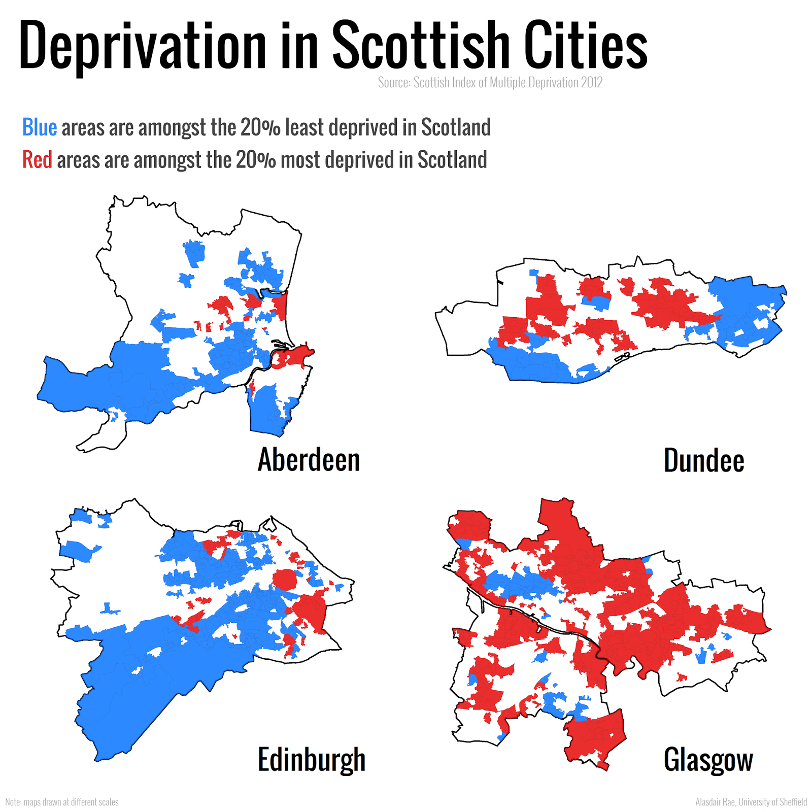
Over the past decade I've spent a lot of time looking at patterns of deprivation across the UK. One thing I've often noticed is the way football grounds regularly appear in the very poorest neighbourhoods. I've blogged on this topic a few times in the past, most notably in 2012 when I looked at the location of English Premier League grounds in relation to the deprivation level of their areas. I also noticed this in relation to the Scottish Index of Multiple Deprivation when looking at the East End of Glasgow in 2009. Given the history of football, its industrial working class origins, the development of British cities, and land values (to name just a few factors), none of this should be a surprise. But since a new English deprivation dataset was released in September, I wanted to revisit the topic and make a few maps, just to see if anything has changed. That's what I've done here - one map showing the location of each Premier League ground and the deprivation level of the area it sits in - and its wider neighbourhood. Further explanation follows below.

Note the blue area to the north east - now Highbury Square

Most areas in the neighbourhood are in the 20% most deprived

Bournemouth is the one big exception - it's at the opposite end of the scale

Stamford Bridge is in a much more mixed area than most

Selhurst Park sits right beside some more deprived areas

Goodison and Anfield look very similar  - only about half a mile apart

The wider area of Leicester's ground is more mixed

This is quite typical of much of north Liverpool

Manchester City play in the most deprived area of any top flight team

Manchester United are situated in a more mixed land use area

Newcastle United's pitch is split between areas - I've based this on majority area

Norwich City's ground is also in a more mixed neighbourhood

St Mary's is situated in one of the city's most deprived zones

Stoke also play in quite a deprived area - though there's more variation nearby

Like many newer stadiums, this ground is in a slightly more mixed area

The Welsh deprivation dataset is used here - but similar story to be told

Post-riots, much has been said of regeneration in this area of London

Watford play in a much less deprived locality

West Brom's ground is in the most deprived decile of England

Another ground split between areas - but still more deprived than not

What does all this tell us?
The most obvious thing to emerge from this simple mapping exercise is that more than half of all Premier League grounds are located in areas among the 20% most deprived in the country, but a good few are not. Two in particular - Bournemouth and Watford - are in much less deprived areas. Nonetheless, if you scroll through the maps quickly, the main colour you'll see is red (for the 20% most deprived). When I see stories in the news about the ability of sport to tackle deprivation, I'm generally all for it, but then sometimes I make a mental comparison between the wage bills of some teams and the neighbourhoods they're located in and I think we've barely scratched the surface of what's possible when we talk of the potential for elite sport to help transform poorer areas. Post-Olympics, this has kind of been forgotten. Having said this, it is good to see that the Premier League and FA's Football Foundation provides money for grass roots development in the most deprived areas as defined by this very same dataset. 


What does it not tell us?
Quite a lot, and I wouldn't want anyone to think that I've done this to pick on any one team. I'm just curious about the relationship between these football grounds and underlying patterns of deprivation because when I look at the data as I map it, I often notice the stadia. It doesn't tell us anything about cause and effect, whether teams are trying to do anything to boost the fortunes of their local areas or what the areas themselves are like to live in. If you want to know more about the underlying data, read this briefing from the Government. Does having a Premier League football team in your area make you poor? Of course not. 


Some of the grounds look the wrong shape - why?
I used building footprint data from the Ordnance Survey in the maps above and the shapes of the grounds are as they were in the original dataset - with the exception of Vicarage Road, which for some reason wasn't enclosed on one side so I made my own version. I've just added a little glow around each ground to make it stand out and then added in the footprints of all other buildings in the wider neighbourhood to help people identify nearby features and roads.


What about when a ground is split between areas?
I could have taken the average deprivation rank here and used that figure but instead I chose to use the deprivation rank of the area that the majority of the playing surface was located in. This was only really an issue for Arsenal, Newcastle and West Ham - and only really notable in Newcastle. 


Explain that 'deprivation percentile' thing again please
In England, there are 32,844 areas known as Lower Super Output Areas. These LSOAs are small areas which the government use to report all kinds of statistics, including Census data. When they publish their Indices of Deprivation, they give each one of the 32,844 areas a rank, from 1 (most deprived in England) to 32,844 (least deprived in England). Therefore, it's a relative measure that allows us to compare one area with another, all across the country. The data are often split into five or ten chunks (quintiles or deciles) for reporting purposes but here I've decided to use 'percentiles' as it's more precise. If an area is in percentile 5, it's among the 5% most deprived in England, and so on. If it's in percentile 95 (like Bournemouth's ground) then we can say it's not very deprived at all and actually highly likely to be a very affluent area. In the case of Swansea City, I've used Welsh deprivation data from 2014. This classifies places in almost exactly the same way, although there are 1,909 areas in Wales rather than 32,844. These areas have an average population of around 1,600.


Isn't this all just pointless area classification?
You might think so, but the Government use these Indices to make all sorts of important decisions, in healthcare and education for example. If you're in an area classified as being among the 20% most deprived, for example, you might find that you're eligible for some kind of funding - there are loads of examples of uses, with sport being one of many. You can find quite a few other examples in section 1.4 (p. 8) of this report. We must also remember that not all people living in areas classified as 'deprived' or 'not deprived' match that description - this dataset classifies areas not people.


When are you going to expand this to include my team?
I'm not planning to, but I'm sure it would be even more interesting than the Premier League.


Curiosities
On all the maps, north is up so I couldn't help notice that Manchester United seem to be the only team playing on an east to west pitch. I'm guessing most grounds don't do this so that they can avoid the setting sun problem - and in fact Old Trafford cricket ground rotated their pitch 90 degrees to avoid this problem in 2010. Shades of blue - representing the 40% least deprived areas - appear on only 7 of the maps, and only two grounds are in such areas. Red (20% most deprived areas) appear on 19 maps - only Watford is the exception. The maps for Everton, Man City, Tottenham and West Brom are entirely red - which indicates that these grounds and surrounding areas (a few hundred metres in each direction) are within wider areas classified as the most deprived in England. The very most deprived areas to appear on any of the maps are ranked 24 (beside Goodison) and 29 (beside Anfield). 


Which team do you support?
ICTFC, of course. But not very enthusiastically. 


Thursday, 1 October 2015

Are map legends too lazy?

A somewhat click-baity blog title, but I wanted to crowdsource some knowledge from proper carto/viz people, so if you have any insights on what I write, please feel free to get in touch via twitter or e-mail. No doubt what I write about below already has a name but I don't know what that is and I haven't seen this functionality in proprietary or open source GIS. By asking 'are map legends too lazy', what I really mean is are GIS-made choropleth map legends doing enough for us in their current form - and is there an opportunity for us to add some new functionality which enhances the communicative power of the humble choropleth legend? An example... look at the map below, which I created in QGIS. It's a map of a new deprivation* dataset for England, focused on the local authority of Birmingham.

Deprivation choropleth, with legend and inset map

This dataset is typically understood and discussed in terms of deciles, hence the classification used above. The dataset goes from decile 1 (most deprived) to decile 10 (least deprived) - within the context of England as a whole. Cities like Birmingham tend to have a higher proportion of their small areas in the most deprived decile, and in map form this results in lots of red and not much blue, as you can see above. If you wanted to find out how many areas were in decile 1 (most deprived) you would know that it was 'a lot' but because the inner-urban areas tend to be smaller in size (relative to the blue ones), making an accurate assessment visually is quite difficult. In fact, owing to the different sizes of the spatial units, you could quite easily take the wrong message away from a choropleth like this.

My solution? Make the legend do more work. Make it tell us not just what the colours represent but also what proportion of areas are in each category by scaling the colour patches relative to the proportion of areas in each choropleth class - in the form of a bar chart - what I call a 'bargend' (jump in at this point if you already have a name for this). You could, without much effort, add in a table or a separate chart, but I want the legend to actually be the bar chart. In part, I was inspired to attempt this in QGIS because of Andy Tice's prototype scatterplot layout and his comment that he'd like to get it working in the QGIS Atlas tool. Here are some results, followed by further thoughts.

This time, I've added in a 'bargend'

A closer look at the bargend for Birmingham

When I do a visual comparison of the Birmingham map, I'm surprised that the least deprived (i.e. richest) areas only account for 1.7% of the total, because I'm drawn to the blue of the choropleth. This could be solved though a cartogram approach, but I wanted to preserve geographical accuracy here. I'm not surprised that almost 40% of areas are in the poorest decile - that's what I'd expect from what I know about deprivation in English inner-cities. Let's look at another example below.

The London Borough of Tower Hamlets

This time I've shown one of the poorest parts of London - Tower Hamlets. An interesting aside here is the emergence of one area in decile 9 (i.e. richer area) compared to the pattern from 2010. This is almost certainly linked to gentrification and displacement rather than individuals becoming 'less deprived'. I find the extra information provided in the bargend very useful analytically/cognitively compared to the simple legend we would normally use.

Now let's look at a few more...

Liverpool contains relatively few 'non-deprived' areas

Like Liverpool, Manchester has many poor areas

Middlesbrough has the highest % in the most deprived decile

One of the benefits of this approach, in my view, is when you compare different places - you can click on an image above and then go forward and backward to make comparisons. The added value of the bargend approach means that you have precise details of the proportion of areas in each decile and you can make more meaningful comparisons. You could just do this with a table or chart and dispense with the map altogether, but then you'd lose the very important ability to identify where precisely individual areas are and where spatial concentrations of deprivation (and affluence) exist. Talking of affluence, it's only fair that I show you some maps of places that are at the opposite end of the scale. Two prime examples...

A beautiful part of the world, but very blue

Hart, you almost broke my chart (highest % in decile 10)

I'll wrap up with a few points.

1. I'd love it if someone could find a way to add in this functionality natively in QGIS. I had to do a bit of thinking and tinkering to automate this in the Atlas tool, but I now have it working well and everything dynamically updates and re-positions itself once you set it up.

2. I wouldn't always want to use a bargend, but I think it's something that adds value without taking up much more space (if any) in map layouts.

3. I'm trying to think of any drawbacks of this approach, but I can't. I'm happy for others to chip in with ideas on this.

4. I think 'bargend' is a terrible word. Please tell me it already has a nice sounding name, or invent one for me. [update: in my rush to coin a phrase, and because I was mapping deciles as categories - as in a bar chart - I was thinking about bar charts rather than histograms. This is really a histogram but it uses named categories (deciles) which in theory could be re-ordered and the chart would still make sense, so perhaps the bargend retains qualities of both and, anyway, a histogram still uses bars]

5. Are map legends too lazy? Not really, but they can sometimes work harder.


Addendum
Andrew Wheeler very kindly got in touch to share a few relevant papers on the subject. The Kumar paper is very close to what I propose (though he does the chart for the entire dataset rather than a subset) and he calls it a 'Frequency Histogram Legend' - more accurate perhaps, but less catchy. The Dykes et al. paper is very interesting and I like the treemap approach.

Hannes (@cartocalypse) also got in touch to say he likes the idea and he's suggested 'legumns', which is also useful (but more difficult to pronounce!).

I'll add more on the topic if people respond.

* Just in case the use of this word sounds odd to you, we use the word 'deprivation' in the British context in studies of urban poverty/disadvantage but it's not exactly the same thing. I've written about this in previous academic papers but to all intents and purposes more deprived means 'poorer' and less deprived means 'richer'. In the maps above, you could say red: poor and blue: rich and you wouldn't be wrong (ecological fallacies notwithstanding).

Saturday, 17 January 2015

Interpreting political maps

I recently tweeted a couple of maps showing the 100 most and least deprived constituencies in England. I used the 2010 English Indices of Deprivation to calculate this, aggregating the data from smaller areas to parliamentary constituencies. The method is not perfect but on the whole the areas identified are either among the poorest or richest in England. There are 533 constituencies in England so the figure of 100 is roughly the 20% most and least deprived (18.76% to be more precise). I shaded the maps using red for Labour, blue for Conservative, Yellow for Liberal Democrats and so on. The most obvious thing about the maps is, of course, the fact that the most deprived map shows nearly all Labour constituencies and the least deprived shows almost all Conservative constituencies. Click the caption below the images to see interactive versions.

100 most deprived constituencies


100 least deprived constituencies

These kinds of maps often make a big impact and are shared widely but people tend to draw conclusions from the patterns they see that are not necessarily correct - and often conclusion which mirror pre-existing biases and perspectives. For example, some people see these maps and claim that voting Labour makes you poor or that only rich people vote Conservative. Some would even claim that this proves that Labour has failed the constituencies they serve. Opponents would argue that coalition cuts have merely deepened spatial inequalities and hit Labour-voting areas hardest. This is all a bit dramatic, but you don't have to search online long to find such views.

Other people might say that if you want to be richer you should vote Conservative. Other people would tell you not to be so simplistic and point to the way in which voting patterns are formed at the local level. Still others might point to the longstanding economic differences between north and south in England and say that this has something to do with it. Perhaps others will say that the Conservatives are the party of the rich and that Labour are the party for the poor. There are varying degrees of truth in all these views but the point I want to make here is that none of this can be proven just by looking at a political map.

For me, such maps are a starting point for a conversation about what these patterns might mean, whether they are a problem and what might be done about it, if anything. I'm not making these maps because I'm pro-Labour or pro-Conservative or because I think that they prove anything in particular but because I want to draw attention to the patterns and what they might mean. Finally, some observations from the maps...


  • There are no Labour constituencies amongst the 100 least deprived in England.
  • There are 2 Conservative constituencies amongst the 100 most deprived in England.
  • Sheffield Hallam (Liberal Democrat, Nick Clegg) is amongst the 100 least deprived constituencies in England. 
  • There are 5 Liberal Democrat constituencies amongst the 100 most deprived in England.
  • There are 7 Liberal Democrat constituencies amongst the 100 least deprived in England.

It will be very interesting to see how these patterns change (if at all) after the General Election this year.


Friday, 4 April 2014

Some thoughts on mapping spatial patterns of deprivation

In my research into the geography of deprivation across the UK, I frequently use maps to illustrate the spatial patterns associated with the areas identified as 'least' or 'most' deprived according to official indices such as the Scottish Index of Multiple Deprivation or the English Indices of Deprivation. Lots of other people do similar kinds of things, including mapping gurus such as Oliver O'Brien from UCL (his work is much nicer). A recent example is shown below, which I also tweeted this week. It's difficult to know exactly how people will interpret such maps, particularly when they are only seeing them on twitter without much in the way of context being provided, so this short blog fills some of the gaps and discusses some wider issues.


In previous academic papers (e.g. Urban Studies, 2009; Regional Studies, 2012; Local Economy, 2012) I've written about deprivation quite a bit, and on the need for the debate to centre not just on 'deprived' areas but more widely upon the wider dynamic of socio-spatial inequality. It's a shame that the focus is still very much on 'poor' or 'deprived' areas so in an attempt to draw attention to the urban inequalities which exist across the UK I attempt to illustrate the socio-spatial disparities within different cities. I also did this in a report on Sheffield from 2011 where I tried to draw attention to the socio-spatial inequalities within English cities, as shown below. It's not that concentrated deprivation isn't a problem (far from it) but rather that it's part of something much bigger.


These kinds of maps do draw attention to the general issue but of course they can lead to all sorts of other conclusions and claims because as we know, maps are an abstraction from reality and they do not represent an absolute 'truth'. These maps simply colour small areas within cities according to how they are classified by a government metric which attempts to say how 'deprived' places are. This may be a dubious practice in many respects, but it is woven into the fabric of how places are understood in a policy context and how problems are defined. It's important that we understand what this kind of mapping allows us to say and what it does not. Some of this is covered on the 'What does it all mean' tab of my Scottish Index of Multiple Deprivation 2012 map site, but I want to make a few more points here...

1. Colours. They are not intended to match up to any political party but some people inevitably make such inferences. The maps say nothing about the causes of the patterns, or who is responsible for them. But it doesn't stop people from talking about it and that's no bad thing. There is a lot more that could be said about colour choice but I'm going to leave it there for now.

2. The trouble with choropleth maps. Maps shaded according to some value (such as deprivation rank) present a misleading picture in a number of ways but two important ones stand out here: a) not all people in the area are 'deprived' or 'non-deprived'. This is the classic 'ecological fallacy' issue at work - the third paragraph here says more about that; and b) the shaded zoned themselves cover much wider areas than people actually live in so a big blue or red area gives the impression of a lot of something, when in fact the population of larger spatial units is similar to the smaller ones (as it often is with LSOAs or Data Zones in the examples above). 

3. The sometimes arbitrary nature of local authority boundaries. Places like Leeds are often said to be 'overbounded', whereas Manchester is 'underbounded'. This means that the local authority boundary either extends beyond the core urban area or it doesn't include much of it at all. So, in the cases of Manchester and Liverpool above if you were to extend the boundary of the map you would see more areas that are not so deprived. However, the point here is that local authorities have to deal with the financial, social and spatial implications of these patterns. What happens beyond the boundary is not part of their remit - even if it does impact upon them. The boundaries may be arbitrary in some respects but they have very real implications.

4. Why not take a different approach? A good idea, and one that Oliver O'Brien in particular has been very successful with. If we only look at where people actually live then we get a more realistic (but still not 100% accurate) picture of the spatial patterns associated with deprivation. This can be done using dasymetric mapping, where we assign the attributes of areas to individual features. This isn't a perfect definition, and the technique itself can lead people to assume a higher level of accuracy than can actually be obtained from the underlying data but it has advantages over standard choropleth maps in relation to depicting the places where people actually live or work. See also Neal Hudson's London tenure map in this style. The new OS Open Data VectorMap District buildings layer for Great Britain allows us to do this, so I've produced an example map for Glasgow based on the one in the first image above. This time you can only see the areas where there are buildings (though many are not residential properties).


Is the map above more 'truthful' than the normal choropleth? Probably not. However, this is all irrelevant if we aren't concentrating on the underlying patterns we're trying to draw attention to in the first place. The point is that in cities like Liverpool, Manchester and Glasgow the high levels of deprivation/poverty/disadvantage sit in stark contrast to areas at the other end of the scale. Also, places that we think of as 'deprived' are often far from it - as Peter Matthews might also argue. It's this kind of inequality which I'm attempting to highlight with my mapping - though I do of course like a nice looking map (I've also produced more than a few stinkers in my time). The point of all this? I hope that these maps can start a conversation about the underlying issue. I'll end with an extract from my 2012 Regional Studies paper on the issue...


Wednesday, 1 May 2013

Population 'explosion' in English city centres

A paper I wrote about English urban policy and the 'return' to the city is now out in Cities, so I thought I'd blog about it. It's just something I wrote after the first release of small area data from the 2011 Census and the results are not entirely surprising to those with a knowledge of these things but the scale of change over the decade from 2001 to 2011 was pretty big, particularly in the case of Manchester, which I've written about previously. I also reflect upon wider international issues associated with 'reurbanization' (with a z because it's a US journal!) so I think that although the focus is on England it should have wider resonance.


I discuss this growth in the context of New Labour's urban policies, and particularly those which emerged from the Urban White Paper of 2000. Although some of the aims were achieved (e.g. making city centres look nicer, with better design), I conclude that the changes have been mostly superficial and that perpetually high levels of inner city deprivation in cities which were the main foci for urban policy during this period does not represent a very positive legacy, despite the 'success' of getting people to move back to the city. The fact that this picked up immediately by @urbandata suggests that these themes are also relevant in the United States, and beyond. It's a short paper but I hope to follow up on it at some point* with more detailed data on tenure, etc. to dig a little deeper.


*This is normally code for 'it will never happen'!

Monday, 8 April 2013

Deprivation in your area - search and zoom

After making a new website when the Scottish Index of Multiple Deprivation 2012 was released, I've been looking at some of my old English IMD web pages and tools and so have decided - in anticipation of the next update to the IMD - to add a 'search and zoom' tool so that anyone who is interested can find out what deprivation is like in their area - or any other area of England you are interested in. Like my previous versions of this kind of thing it's based on Google Maps but in the version seen in the screenshot below you can simply enter a place, neighbourhood, postcode or address (or even an organisation, like Centre for Cities) into the search box and it will go straight there after clicking 'search'. Click the image or the link below to use the tool.


As usual with these kinds of maps, if you click on an area the pop-up will give you more information. The next update of the IMD was to have been in 2013 but I'm not sure if that is still going to happen. However, I've updated this tool just in case so that I can add in the next update whenever it becomes available. The Scottish version of this tool is on this page, but I have not yet done the same for Wales or Northern Ireland.

Tuesday, 18 December 2012

SIMD2012 - An Interactive Website

With the release of the latest version of the Scottish Index of Multiple Deprivation I thought I would take the time to put together an interactive mapping website so that people who are interested in exploring spatial patterns of deprivation could easily interact with the data. The official Scottish Government interactive mapping site has some nice features but I find it a bit cumbersome and the map interface is too small for my liking so that's why I've produced my own version, based on Google Fusion Tables.


Putting this together has prompted me to develop some additional mapping tools using Fusion Tables code and these can be accessed via the 'Tools' tab on the new website. The 'search and zoom' allows you to enter a place you want to look for and when you hit 'Search' the map immediately pans and zooms to that location.   The other tool I've created simply lets you turn the SIMD map layer on and off, which is quite a useful feature.

I've just looked at the relative ranks of places within Scotland in this site. For details of absolute change you can see the employment and income domain data available from the new SIMD 2012 website.

Friday, 23 November 2012

Premier League Poverty?

The financial health of the English Premier League is a regular topic of discussion. No matter how you look at it, the sums of money involved in the operation of Premier League teams are immense and it looks even more striking when you consider the locations of their stadia - typically in the most deprived areas of England. This is related to a number of factors (e.g. history, land values), but in my work on neighbourhood deprivation and mapping I've noticed a common trend over the years so I decided to look at the location of all 20 current Premier League teams in England and how deprived their local area is, using the Government's official measure of deprivation (the IMD*). The maps below show each team and its area's deprivation rank within England, where 1 = most deprived and 32,482 = least deprived. Shading: red = poorest 20% of areas in England, yellow = next poorest 20%, and so on... Liverpool is most deprived and Fulham least. See below for more.

Arsenal - IMD 4,432 
Aston Villa - IMD 479

Chelsea - IMD 5,483

Everton - 1,070

Fulham - IMD 19,076

Liverpool - IMD 219

Manchester City - IMD 599

Manchester United - IMD 10,235

Newcastle United - 18,570/6,582 (split)

Norwich - IMD 12,253

Reading - IMD 6,843

Southampton - IMD 855

Spurs - IMD 950

Stoke - IMD 2,171

Sunderland - IMD 6,291

Swansea - WIMD 374

West Brom - IMD 1,619

West Ham - IMD 3,593

Wigan - IMD 429

QPR - IMD 7,848

In Newcastle, the stadium is split between two areas, so I have given the deprivation ranks for both areas. The English Indices of Deprivation obviously only cover England so I have included a map for Swansea which uses the Welsh Index of Multiple Deprivation figure from 2011. More on that in a previous post. Similar patterns exist in Scotland, as you can see from the bottom part of this 2009 post. What does this tell us that we didn't already know? Not much, but it does provide some hard data and an overview of the contrast between the wealth of clubs and the poverty of many local areas they are located in.

* The English Indices of Deprivation 2010 are used here. They rank each of the 32,482 Lower Layer Super Output Areas of England from most deprived (a rank of 1) to least deprived (a rank of 32,482), taking into account such things as income, employment, education and health. There was a similar piece of analysis in Regeneration and Renewal in 2009 but this looked at the local authority areas only and not the specific location of stadia.