Showing posts with label liverpool. Show all posts

Thursday, 1 October 2015

Are map legends too lazy?

A somewhat click-baity blog title, but I wanted to crowdsource some knowledge from proper carto/viz people, so if you have any insights on what I write, please feel free to get in touch via twitter or e-mail. No doubt what I write about below already has a name but I don't know what that is and I haven't seen this functionality in proprietary or open source GIS. By asking 'are map legends too lazy', what I really mean is are GIS-made choropleth map legends doing enough for us in their current form - and is there an opportunity for us to add some new functionality which enhances the communicative power of the humble choropleth legend? An example... look at the map below, which I created in QGIS. It's a map of a new deprivation* dataset for England, focused on the local authority of Birmingham.

Deprivation choropleth, with legend and inset map

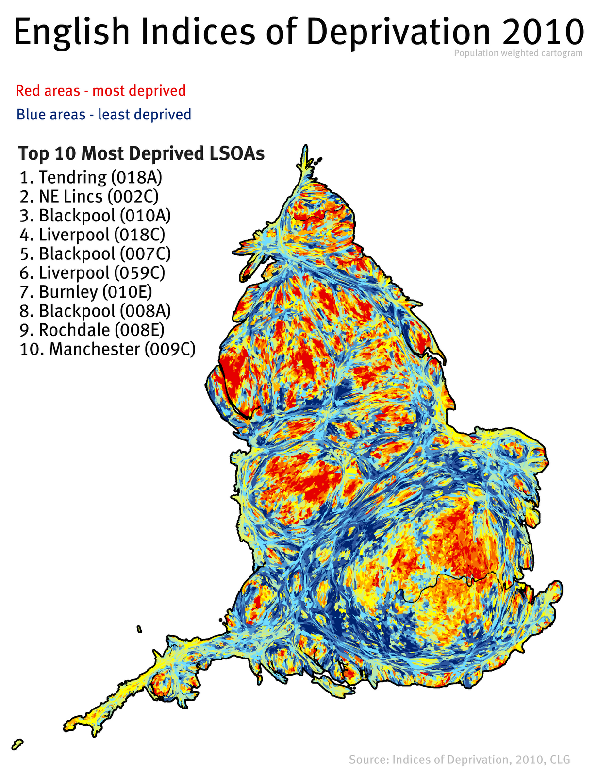
This dataset is typically understood and discussed in terms of deciles, hence the classification used above. The dataset goes from decile 1 (most deprived) to decile 10 (least deprived) - within the context of England as a whole. Cities like Birmingham tend to have a higher proportion of their small areas in the most deprived decile, and in map form this results in lots of red and not much blue, as you can see above. If you wanted to find out how many areas were in decile 1 (most deprived) you would know that it was 'a lot' but because the inner-urban areas tend to be smaller in size (relative to the blue ones), making an accurate assessment visually is quite difficult. In fact, owing to the different sizes of the spatial units, you could quite easily take the wrong message away from a choropleth like this.

My solution? Make the legend do more work. Make it tell us not just what the colours represent but also what proportion of areas are in each category by scaling the colour patches relative to the proportion of areas in each choropleth class - in the form of a bar chart - what I call a 'bargend' (jump in at this point if you already have a name for this). You could, without much effort, add in a table or a separate chart, but I want the legend to actually be the bar chart. In part, I was inspired to attempt this in QGIS because of Andy Tice's prototype scatterplot layout and his comment that he'd like to get it working in the QGIS Atlas tool. Here are some results, followed by further thoughts.

This time, I've added in a 'bargend'

A closer look at the bargend for Birmingham

When I do a visual comparison of the Birmingham map, I'm surprised that the least deprived (i.e. richest) areas only account for 1.7% of the total, because I'm drawn to the blue of the choropleth. This could be solved though a cartogram approach, but I wanted to preserve geographical accuracy here. I'm not surprised that almost 40% of areas are in the poorest decile - that's what I'd expect from what I know about deprivation in English inner-cities. Let's look at another example below.

The London Borough of Tower Hamlets

This time I've shown one of the poorest parts of London - Tower Hamlets. An interesting aside here is the emergence of one area in decile 9 (i.e. richer area) compared to the pattern from 2010. This is almost certainly linked to gentrification and displacement rather than individuals becoming 'less deprived'. I find the extra information provided in the bargend very useful analytically/cognitively compared to the simple legend we would normally use.

Now let's look at a few more...

Liverpool contains relatively few 'non-deprived' areas

Like Liverpool, Manchester has many poor areas

Middlesbrough has the highest % in the most deprived decile

One of the benefits of this approach, in my view, is when you compare different places - you can click on an image above and then go forward and backward to make comparisons. The added value of the bargend approach means that you have precise details of the proportion of areas in each decile and you can make more meaningful comparisons. You could just do this with a table or chart and dispense with the map altogether, but then you'd lose the very important ability to identify where precisely individual areas are and where spatial concentrations of deprivation (and affluence) exist. Talking of affluence, it's only fair that I show you some maps of places that are at the opposite end of the scale. Two prime examples...

A beautiful part of the world, but very blue

Hart, you almost broke my chart (highest % in decile 10)

I'll wrap up with a few points.

1. I'd love it if someone could find a way to add in this functionality natively in QGIS. I had to do a bit of thinking and tinkering to automate this in the Atlas tool, but I now have it working well and everything dynamically updates and re-positions itself once you set it up.

2. I wouldn't always want to use a bargend, but I think it's something that adds value without taking up much more space (if any) in map layouts.

3. I'm trying to think of any drawbacks of this approach, but I can't. I'm happy for others to chip in with ideas on this.

4. I think 'bargend' is a terrible word. Please tell me it already has a nice sounding name, or invent one for me. [update: in my rush to coin a phrase, and because I was mapping deciles as categories - as in a bar chart - I was thinking about bar charts rather than histograms. This is really a histogram but it uses named categories (deciles) which in theory could be re-ordered and the chart would still make sense, so perhaps the bargend retains qualities of both and, anyway, a histogram still uses bars]

5. Are map legends too lazy? Not really, but they can sometimes work harder.


Addendum
Andrew Wheeler very kindly got in touch to share a few relevant papers on the subject. The Kumar paper is very close to what I propose (though he does the chart for the entire dataset rather than a subset) and he calls it a 'Frequency Histogram Legend' - more accurate perhaps, but less catchy. The Dykes et al. paper is very interesting and I like the treemap approach.

Hannes (@cartocalypse) also got in touch to say he likes the idea and he's suggested 'legumns', which is also useful (but more difficult to pronounce!).

I'll add more on the topic if people respond.

* Just in case the use of this word sounds odd to you, we use the word 'deprivation' in the British context in studies of urban poverty/disadvantage but it's not exactly the same thing. I've written about this in previous academic papers but to all intents and purposes more deprived means 'poorer' and less deprived means 'richer'. In the maps above, you could say red: poor and blue: rich and you wouldn't be wrong (ecological fallacies notwithstanding).

Wednesday, 14 January 2015

Visualising Residential Mobility in Urban England

Last year I produced a few commuting maps of England and Wales after the 2011 Census data were released. Now I've turned my attention to mapping patterns of residential mobility in urban areas of England as part of my work on understanding housing markets. This post highlights some of the patterns uncovered in the data - which are output area level migration flows for England and Wales (about 4 million individual flows). If you're interested in how I did this you can find out in a previous post. The first image is of the urban North West of England and for subsequent images I've zoomed to different parts of the country. I've kept it simple and only showed the flow lines, apart from in the North West where I've also added some place labels. It's all a bit experimental at this stage.

You can find a higher resolution image here


The North East of England


West, East and South Yorkshire


I think some places are missing (working on it)


I've adjusted the brightness a little to make this clearer

What does all this show? It shows what many people may already know or expect but basically it illustrates the extent of residential mobility patterns in some of England's major urban areas - plus a bit more in the South West example above. There's a lot more that could be said about this but for now I'll leave it at that. I'm sorry if your town or city isn't on the map! Maybe next time...


Notes: I've filtered the data so in certain cases some places are not shown (e.g. in the North West image places in North Wales are not visible). Also, I've only shown flows of a certain volume in order to filter out the noise. 

Friday, 16 December 2011

Deprivation in Sheffield

This summer I was asked to write a report about deprivation in Sheffield. I finished this in September and the reaction since then has been quite positive (i.e. people have actually been reading it!). So, I thought I'd link to it directly here and also pull out a few of the main findings from it. Click on the image below to see the pdf - or just click here.


In the report I look at how patterns of deprivation in Sheffield compare to 13 other cities in England. Sheffield is not as deprived as many other cities (e.g. Liverpool, Manchester) but the geography of deprivation in the city means that it is one of the most divided - spatially at least. In one sense this might have something to do with the boundaries of local authorities and how wide an area they cover but, ultimately, it is at the local government level that issues associated with deprivation are most acutely felt so the boundary issue is only part of the problem.

I also look at the differences between areas that seem to be similar in terms of how deprived they are. In doing so I draw upon some previous work I did with colleagues at the University of Manchester. The bottom line here is that there there is a need to think more deeply about the different roles and contexts of areas and how they differ from each other - particularly in relation to how policies are formulated.

There is also a need to think about issue of social and spatial inequality more widely rather than simply focusing on the 'most deprived' locations, though of course this will remain a policy priority in many cities. 

Monday, 7 November 2011

Learning from the past in regeneration?

Last week, a government select committee published their report into regeneration. This was all about regeneration (and its failures) in England, but much of it resonates more widely. Before I mention what was in the report, it is worth noting the composition of the committee: 5 Labour MPs (including the committee chair), 6 Conservative MPs, 1 Liberal Democrat MP. I should also mention that last week a paper of mine was published. This is significant not because I had something published (!) but because the paper was entitled 'Learning from the Past? A Review of Approaches to Spatial Targeting in Urban Policy' and it has a lot to say about the issues in the select committee report. Unusually, for me, it also has no maps or stats in it! I look at examples from across the world and my view is that there is a problem with the way we conceptualise the 'problem' in urban policy, but enough about that.


Back to the select committee report... The most significant thing the report says - and this was widely reported in the news and regen media - is the following quote, from the opening paragraph of the conclusion:

"Regeneration to enable growth offers little evidence that the Government has a coherent strategy for addressing the country's regeneration needs. The document lacks strategic direction and fails to target action and resources at the communities most in need. The measures it sets out are unlikely to bring in sufficient resources or to attract the private sector investment that in many areas is badly needed."

The part about investment being badly needed in many areas is perhaps most significant in some of the former housing market renewal areas - one example being the Welsh streets in Liverpool - see a Google street view of this here. This subject is covered more generally in Part 3 of the report where there is a particularly powerful quote from from Ros Groves, Chair of a Liverpool residents' association, who said:

"We need to think what my people are living in and the conditions they are living in. It is a famous line: we have kids in schools; you ask them to draw a house and they will draw you a house with boarded-up windows, not fancy little curtains or anything else. To me, that is not a future that we can build on, which is criminal. We have a right to have a decent life and place where we live, and that is the one thing that we ask Government. Can we have it? Can we let any Pathfinder area be left with what some people are being left to live in?"

As you can tell, the committee are not exactly thrilled with the government's approach to the housing market renewal programme. Regeneration and Renewal used the word 'damning' and that about covers it.

In Learning the Lessons in Part 4 of the report there is a quote from Paul Lawless, Professor of Urban Policy at Sheffield Hallam University. His views on learning lessons are summed up in one particular quote: 

"One marked weakness in this strand of policy has been a reluctance on the part of new administrations to learn from previous regeneration initiatives. There is every possibility of this happening again, as a new government launches a regeneration programme with little if any acknowledgement of lessons from previous interventions."

My small contribution to the literature effectively finds the same things, and not just in England but more widely in different parts of the world. Not learning from the past, however, is not restricted to regeneration but the implications of not doing so here are particularly severe for those living in areas targeted by urban policy. 

Full details of the inquiry associated with the report can be found here. That's all I have to say for today! Take a look at the report - it makes fascinating reading (though I couldn't find it a pdf version).

Monday, 3 October 2011

Comparing Populations: Night Time vs. Day Time

Esteemed Canadian and fellow researcher Brian Webb, from the University of Manchester, recently sent me an interesting image which compares the population of Washington D.C. in the day to the population at night. This got me thinking. I did a bit of digging and found some of my old data. Put simply, I had two datasets for wards in the North West of England. One file contained the resident population of wards and the other had the population of wards during the day time (i.e. residents, minus out-commuters, plus in commuters). Out of this came two visualisations, as shown below (red peaks = more people) and a short video.


I also decided to turn this into a very simple animation, which is embedded below. I have also produced a larger version of this on its own page. Note: the video embedded below will keep playing once you click play. The larger version allows you to pause the video and watch at your own pace.

Unable to display content. Adobe Flash is required.

Although these are really just some pretty pictures there are some important points to be made here. We think about the population of places - and the associated local costs and constraints - in relation to resident population but in some areas the day time population is so high that the impact on the local area is far out of proportion to the size of the resident population. Another matter is the well known issue of spatial mismatch or, more generally, understanding the differences between where people live and where people work and the implications of this. 

In short, understanding the spatiality of populations is important for planning and policy purposes - these visuals are just a simple way of telling the story of data. This is important because the data on display here comes from an analysis of a commuting data matrix of 1000 x 1000, or one million cells of data. So, another point here is that data on its own is not information, as we all know.

Friday, 2 September 2011

Divided Cities?

There has been a lot of talk recently about the links between deprivation and the recent riots in England (e.g. this from the Guardian), and since I'm interested in the issue I thought I would do some very basic analysis to look at the spatial divisions of deprivation in English cities. To do this I took London, the eight core cities plus Bradford, Coventry, Hull and Leicester and mapped the 10% most (in red) and 10% least (in blue) deprived (IMD 2010) areas on one large map graphic. The results are shown below - click the image to enlarge.


Some interesting comparisons can be made from this image. In Hull, Leicester, Manchester and Nottingham there are no areas amongst England's 10% most deprived and in Liverpool there is only one. In Sheffield there is a clear NE/SW split in terms of the location of the most and least deprived and in Manchester, Birmingham and Liverpool the number of areas in the most deprived 10% is quite high.

Not much else to say now except that I think in studies of deprivation we should perhaps be more concerned with inequalities and how they manifest themselves spatially.

Thursday, 11 August 2011

Comparing Deprivation in the English Core Cities

The eight English core cities outside London often work together on issues that affect them. One thing I've been looking at recently on some work in Sheffield is how the core cities compare in terms of patterns of deprivation. So, I've mapped and compared them below. Red areas are amongst the 10% most deprived in England and the darkest blue areas are amongst the 10% least deprived in England. The maps are at different scales but the point here is just to provide a quick visual comparison of cities in this map matrix view.


Thursday, 24 March 2011

Indices of Deprivation 2010

The English Indices of Deprivation 2010 were published this morning. Previous Indices were published in 2000, 2004 and 2007. I've decided to do a few posts on this because I find it very interesting and it does have real implications in relation to policy. In this post, I've done some basic mapping and analysis (click on any map to view it full size).

A quick snapshot first: the most deprived LSOA is in Tendring, Essex. It used to be in Liverpool. Overall, Liverpool, Middlesbrough, Manchester, Knowsley, Hull, Hackney and Tower Hamlets remain the most deprived local authorities. So, no major surprises.

Overview for the whole of England, with a list of top ten most deprived LSOAs.


Overview cartogram for England, with a list of top ten most deprived LSOAs.


Detailed map showing location of the most deprived LSOA in England.


A zoomable google map version of the above, for good measure.


View Tendring 018A in a larger map

A more focused map of Merseyside, showing Liverpool, Sefton and Knowsley.


Note: The Indices of Deprivation 2010 are produced for small areas called LSOAs. These lower layer super output areas are not 'neighbourhoods' in a formal sense but they often have a high degree of internal similarity. The average population of an LSOA is about 1500 and in total there are 32,482 of them in England. The data used in the Indices are mostly from 2008 but you can read more about this in the technical report.

Friday, 8 October 2010

Travel to Work Areas / Labour Market Areas

I've been doing some work recently which uses travel to work areas rather than local authority boundaries. The analysis is on deprivation in England using the Economic Deprivation Index, so I thought it would make more sense to do the work within the context of more local labour market areas. In England, the best proxy for these is the travel to work area or TTWA.

There are currently 243 of them defined in the UK - and there is a lot more information on this (including the methodology) available here. One part of what I have been doing is to compare the size of TTWAs for different places.

In the maps below you can see the London, Birmingham, Liverpool and Manchester TTWAs displayed at the same geographical scale. The TTWA areas are coloured and the local authority boundaries are overlaid on top of this with black lines. Click on the image below to see it full size in your web browser.

It may be a bit of a surprise to see how big some of the non-London TTWAs are. Clearly, London is the largest and includes the most local authorities but Manchester and Birmingham in particular cover large areas and Liverpool covers a large north to south area.

Friday, 20 March 2009

Spoke too Soon

Further to my last post about Google Maps street view, where I said that it wasn't available in the UK - just this week it has become available, to much hype and hysteria. Twenty five cities in all, including where I live now (Sheffield), where I used to work (Manchester), where I used to live (Liverpool) and where I went to university as an undergraduate (Glasgow). I've hunted around for people I know, but no luck yet... For now, just some images of places I know - note that you can navigate these within the blog!

Housing Market Renewal Area in Liverpool

View Larger Map

Raining in Manchester? Surely Not...

View Larger Map

Tenements in Glasgow

View Larger Map

Friday, 8 August 2008

Deprivation and Spatial Context - The NNIMD

Time for a short post on some of my more recent work. A lot of what I do deals with areas, deprivation and trying to understand the links between the two. Since I live in Liverpool and work in Manchester, I've got a good idea about how some of the most deprived (according to the Index of Multiple Deprivation) areas look, where they are and how spatially clustered they are. I also think that the way we identify which areas ought to be the focus of policy could do with some refinement.

So, here's what I've done. I took the 2004 IMD data and created what I like to call the NNIMD. That is, the Nearest Neighbour Index of Multiple Deprivation. I've written a paper on this for a journal (to appear around October 2009) but I decided in the meantime to update the work for the 2007 IMD and post on it here. The NNIMD takes the IMD scores for all neighbours of an area and averages them to give what you might call a 'spatial context' or 'neighbourhood' deprivation value for each lower layer super output area.

This process is repeated for the entire country (England) so that for each of the 32,482 lower layer super output areas we have a score which provides intelligence on the kind of neighbourhood it sits in, at least in terms of the IMD deprivation score. Yes, it's not perfect and yes there are issues with the definitions of 'neighbourhood' that we have to use, but it's a good start on the way to understanding local spatial context and the role this might play in neighbourhood outcomes. I plan to continue this work in the future, but for now here's a couple of graphics showing how Liverpool looks using the 2007 IMD (first map) and the 2007 NNIMD (second map). [Note: the colour spectrum goes from blue (least deprived) to red (most deprived).]


Friday, 13 June 2008

From Data to Knowledge using Google Maps?

About time for another post I think. This time about things I'm doing with data which I turn into useable information in the hope that it can generate new knowledge. Well, that's the basic idea. Specifically, I've been playing around with google mashup editor, kml and kmz files, and Index of Multiple Deprivation data for 2007. What I've been trying to do is work my way round methods to display IMD data on google maps so that anyone can view it, understand it and maybe even remember it.

One of the main problems with using IMD data is that it means using lots of polygons and when you try to load them in google maps they render very slowly and sometime you get a script error in your browser (IE and FF). This is something to do with the way it all works 'under the hood' but I've been trying to investigate ways to make rendering polygons quicker... We'll see. Here's an example I created quickly with google mashup editor for an area in North Liverpool:

http://jrf-googlemaps-test.googlemashups.com/ - see how polygons load slowly


I've been reading and listening and watching online and it seems once you get beyond about 100 polygons everything goes awry. The solution would appear to be image/tile overlays but then this has some limitations that go against what I'm trying to achieve (query clickability, for example). I know people at CASA have used similar approach with their Gmap creator (I've used this and it works very well) and I can understand why but I just wonder if there is another way...


Since I'm on the subject of CASA, everyone with an interest in GIS/spatial analysis should go and see MapTube. This is really part of a much wider project about spatial literacy - which I am all for! I've said enough today. Will try a less technical post next time.

Tuesday, 6 May 2008

The Index of Multiple Deprivation 2004 to 2007

The new Indices of Deprivation for 2007 were released very late in 2007 and since this is an area I'm particularly interested in, I thought I'd blog on the differences between 2004 and 2007.

I've been exploring IMD 2007 just to see how it compares with IMD 2004 since authors say that they are comparable (but they do of course acknowledge that the methodology is not exactly the same).

For the most acutely deprived wards, there's not too much change, but the most deprived LSOA out of all 32,482 has moved from north Liverpool to south Liverpool (from just beside Anfield, Liverpool FC's stadium to Speke, by Liverpool John Lennon Airport). The list of the most deprived 100 LSOAs (about 150,000 people in total) is still dominated by the North West, with 68 out of the most deprived 100 LSOAs in England. It is also interesting to note the co-location of football stadia and the most deprived LSOAs. This phenomenon is perhaps not that surprising but it is replicated across Great Britian in other indices of deprivation. It also highlights the massive gulf between rich and poor in a very real manner.

More interesting are those LSOAs which have seen a significant change in LSOA rank. Using the 10% cut-off for change in rank (i.e. a move of 3,248 or more places up or down the list) I did a quick bit of analysis just to see how areas might have changed. In total, 2,374 of England's 32,482 LSOAs saw a change in rank of more than or equal to a 10% shift in their IMD category. That's 7.3% of all LSOAs, which seems like quite a lot. Most of these were not among England's 10% most deprived, but a handful were. Seventeen LSOAs among the most deprived 10% in 2004 experienced an improvement in their IMD ranking of 10% or more between 2004 and 2007.

Conversely, there were 11 LSOAs which declined by 10% or more between 2004 and 2007 to place among England's 10% most deprived. Most were in London. Overall, it's interesting to note the changes in ranks of areas and how extreme these can be. I just question if there can really have been that much change in 3 years in some of these cases and if so, what has caused it (gentrification? housing market pressures?). Are those LSOAs which have shown large improvements big success stories or statistical anomalies?

Lots of interesting nuggets when we compare IMD 2004 and IMD 2007.