Showing posts with label london. Show all posts

Monday, 14 September 2015

The Shapes of Cities

For a long time, I've been interested in the shape of cities and I suspect that if you're reading this you might be similarly afflicted. By 'shape' I mean their political boundaries as opposed to their general urban footprint. The latter can be seen by driving around or from a plane window, particularly when it's dark, but the political boundaries are much less obvious. This is particularly true of US cities. Take Houston, Texas - the first example below. 

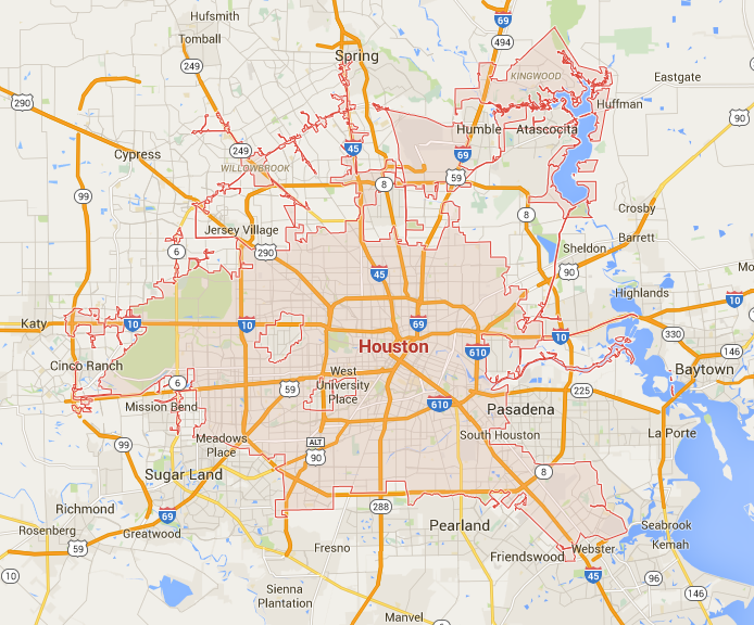
The boundary of the City of Houston - Google Map

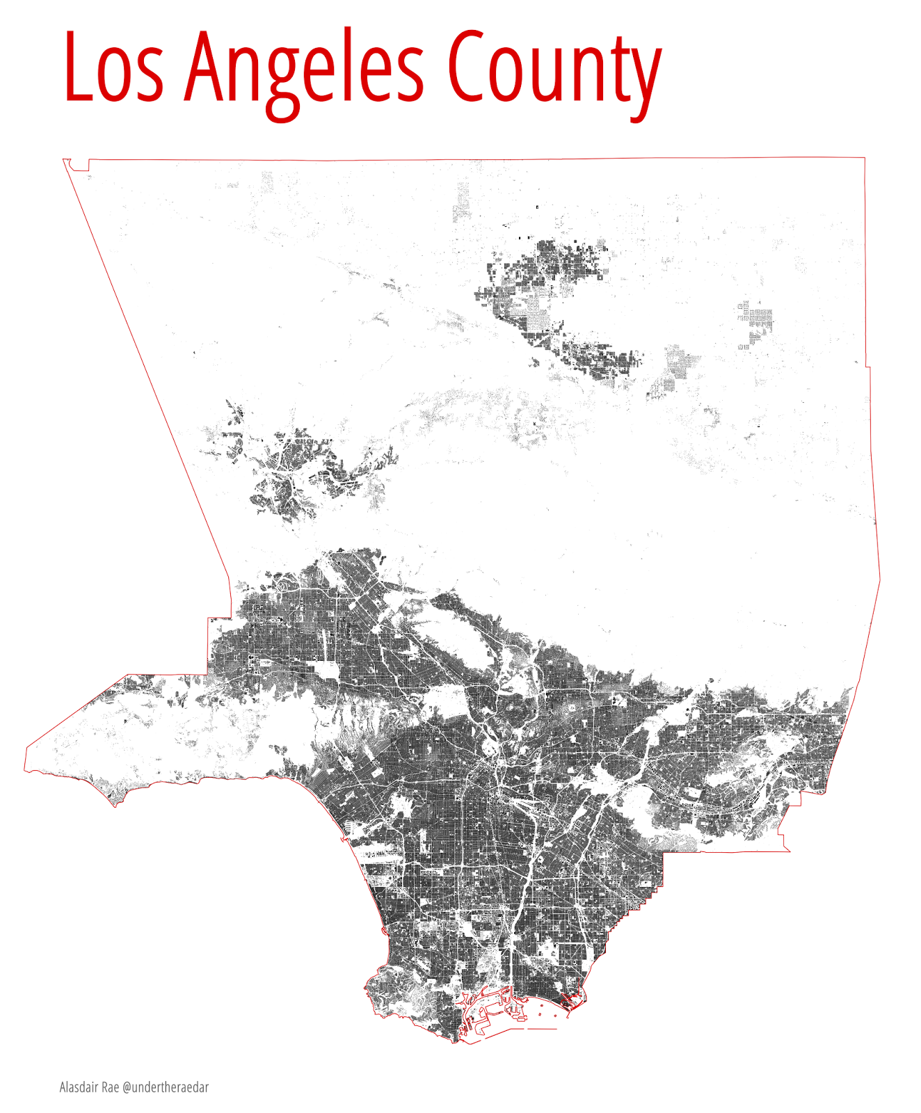
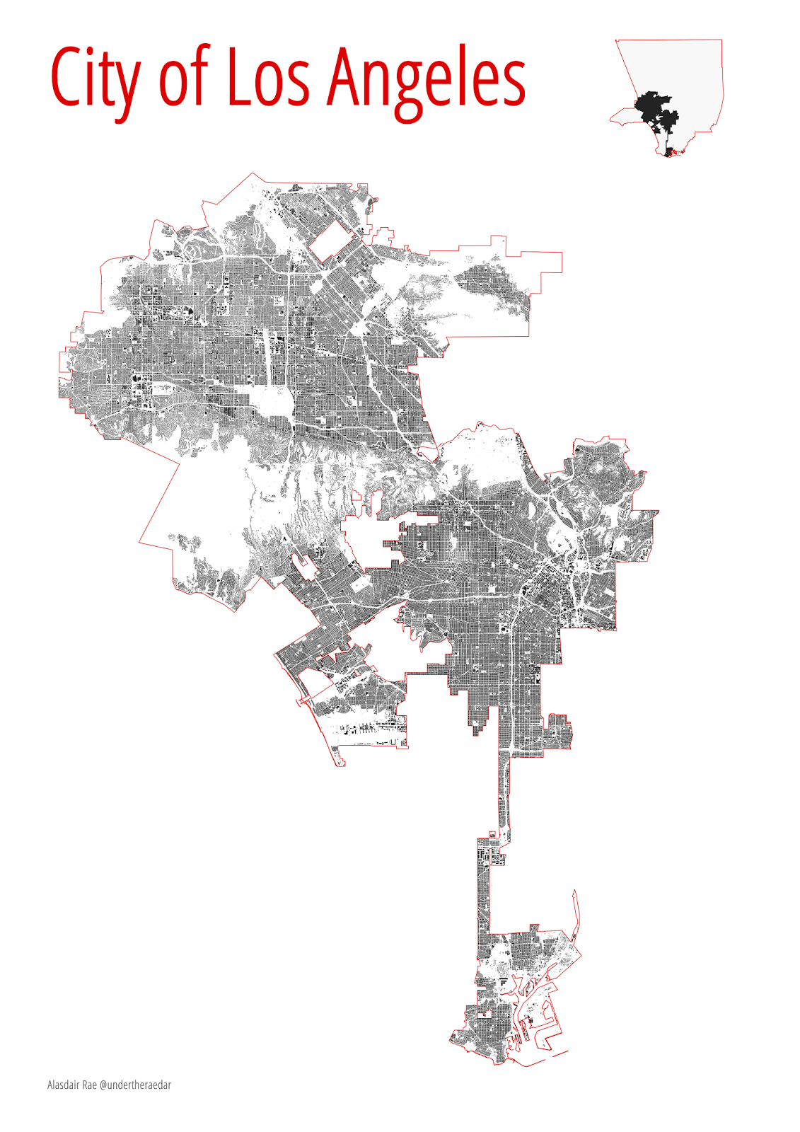
Look closely at this and - at least if you're not used to the political geography of American cities - you might be very confused by this fragmented, segmented mess of boundaries. Then go to Google maps and try different search terms, such as 'city of los angeles' or 'city of columbus' (Ohio) and you'll soon discover that Houston isn't that unusual at all. Try it for other cities and you'll see what I mean. Columbus, Ohio is a particular favourite of mine as I know it quite well having lived there for a couple of years in the early 2000s.

City of Los Angeles - Google Map

City of Columbus (Ohio) - Google Map

These unnatural-looking boundaries are the result of a complex mix of geography, history and politics that have real impacts on the ground. From education and transport to housing and waste management, the shapes of cities really do matter in this respect. Of course, this is a much-studied topic in urban studies, not least by Professor John Parr of the University of Glasgow. In Parr's economic definitions of the city, he outlines four types - but none of these explain the kinds of boundaries we see above. One major explanatory factor in all of this, of course, is tax revenue. But I'm not going to get into that now because it opens up a whole range of other topics, including white flight, suburbanisation, and schooling, amongst other things. The point is that the 'shapes' of cities are not accidental and who is included or excluded is inherently political. 

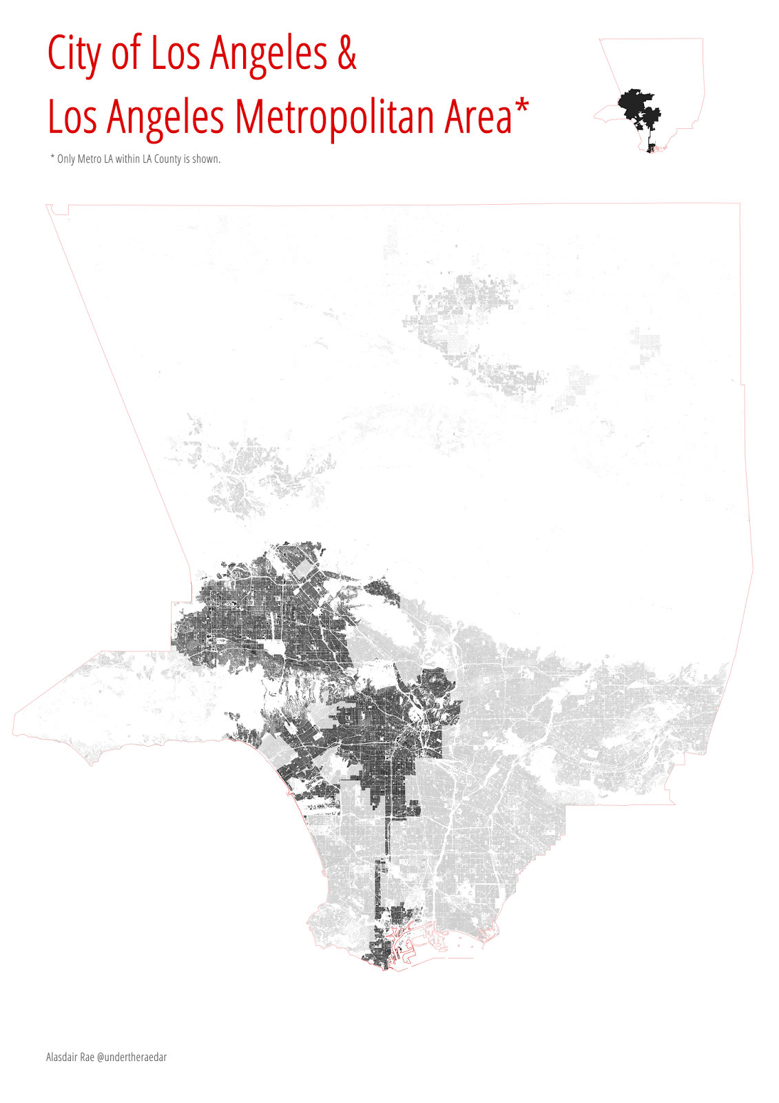
In the United Kingdom, we might not have such unusual city boundaries, but the political geography of our cities is far from perfect - perhaps one reason for the resurgence of the 'city-region' concept over the past decade or so. When we're talking about urban economies, it makes much more sense to think about the functional urban area than it does to use data associated with an arbitrary political shape. This is as true in the US as it is in the UK. The example below shows that the City of Atlanta has less people than the City of Liverpool and that it's only slightly bigger in scale. But anyone who knows anything about these places will understand that 'Atlanta' is much bigger than 'Liverpool and is vastly more sprawling, with a metropolitan population of around 5.5 million compared to less than a million in 'Liverpool' (by one definition). 

Atlanta vs Liverpool - which is bigger?

These kinds of issues are part of the reason organisations like the Centre for Cities use the Primary Urban Area definition of cities for the 64 largest urban areas of the UK. In a recent study, I used a definition developed by Geolytix which is based on the 'sprawl' of the urban area rather than political boundary and found this to be a much better fit than the administrative area. When conducting comparative analyses of cities, we need to ensure we are comparing like with like, and using a functional definition often helps avoid the kinds of underbounded/overbounded problems that arise when (e.g.) comparing places like Manchester and Leeds. The former is normally said to be 'underbounded' because the functional urban area is much bigger than the local authority area of the same name and the latter is said to be 'overbounded' because of its much wider local authority area, which extends beyond the core urban fabric. For a comparison of UK 'city' sizes, see this graphic I produced a few years ago:

All cities shown at the same scale
Surely there's a point to all of this? 

Yes, glad you asked...

For planners, politicians, residents and neighbours, the shapes of cities matter enormously. It might dictate which school your children can go to, whether your local facilities are well funded, whether you have a well-functioning local transport system, when your bins get emptied, how many pot-holes you have in your street and all sorts of other things. But let's not get into that now. Instead, I'll end with another city shape, this time for the City of Detroit (one of my favourite cities, but much-maligned).

Detroit - 8 mile boundary line to the north


Monday, 22 June 2015

Where is all London's new housing?

Some of my recent work on housing markets, mortgage lending and housing search has led me to consider the question of where, exactly, London's new housing is located. On a recent visit to King's Cross I was amazed by the sheer scale of development, particularly all the new flats. Because I've been working with the data for another project - and recently re-examined it for a project proposal which explicitly didn't focus on London - I thought it would be interesting to see whether my perception of the flats boom is based in reality. Of course it is! 

The maps below are based on all new build homes sold in London from 1 June 2010 to the end of April 2015 (the most recent data). During this time, according to HM Land Registry 'price paid' data, there were 42,938 transactions on 42,813 properties. This indicates that quite a few properties are not being picked up in this dataset - e.g. compare it to the completions data from the London Datastore. Nevertheless, the patterns and distribution of property types is revealing. 88.8% of transactions were for flats, 7.1% for terraced houses, 2.4% for semi-detached properties and 1.7% for detached houses.

All property types

Flats

Terraced houses

Semi-detached houses

Detached houses


Clearly, the mix of new housing - and its relative low volume - is something that many people have commented on before, but I've not seen many people look at the geographical distribution in this way. The important questions arising from these maps - as ever - is why are things the way they are? That's something the maps can't tell us but it does provide an interesting starting point for debate. The discrepancy between the Land Registry data and data on completions is also not surprising owing to the way new build housing is sometimes sold, but it would be interesting to explore this more in future. If you do happen to have a few million quid to spare, good luck finding a new detached London house to live in!

A note on the maps... I've geocoded the price paid data using Ordnance Survey's Code-Point Open dataset, which can match sales to postcode units, rather than street addresses. The transparent bubble map is of course far from perfect but I've used it here to convey the scale and location of new housing, rather than to offer a precise fix. So long as it gives the impression of there being a massive splodge of newbuild flats in Central London that'll do for now. I am aiming to highlight the general scale and geography of development as a fairly quick experiment to see what might be done with the data. No plans to make it interactive (update: the best laid plans of... see map point datadump below).


Update (1715, 22 June 2015): I fixed the glitches, which were caused by a rogue space here and there in the codepoint open file. Moral of the story? Build more houses (I think). Always a giveaway when there aren't many dots in Wandsworth. The numbers were correct all along though. Finally, I've added in some information from HM Land Registry on properties not included in the price paid data.


Data excluded from Price Paid dataset - link


Wednesday, 3 June 2015

The beating heart of the City of London

I've had a rush of blood to the head so here I am with a second blog in two days. I'm getting some slides ready for tomorrow's Modelling World 2015 talk in London, which is all about visualising mobility (see below) so I wanted to add in a couple of new visuals on commuting in and out of London. Visualisation can often be just a lot of fancy graphics. This can be useful in itself for a number of reasons (e.g. capturing attention on an important issue, drawing attention to unusual patterns in a dataset) but since I've been working with commuting data in England and Wales I wanted to focus on flows into and out of the City of London. 


This interests me for a number of reasons, including i) commuting can play a significant role in wealth creation and it also needs to be understood in relation to how we measure GVA; ii) commuting is often very stressful and damaging to the individual - particularly long commutes - so I'm interested in the kinds of distances involved and this can be seen easily on a map; iii) commuting can often be environmentally damaging - though this isn't what I'm mapping here; iv) commuting in and around London is often about green belt hopping so I was curious to see how much commuting comes from beyond the metropolitan green belt; and v) commuting is a two-way process and affects places at both ends and in between due to travel. 

So, here's what I did. I took the MSOA-level commuting data for England and Wales (table WUEW01 here), used a bit of QGIS, extracted frames from QGIS using the MMQGIS plugin, then patched it all together in GIMP to create an animated gif. One for inflows, one for outflows and one for in and outflows (thanks to Ebru Sener for the idea). It might run a little slowly in the blog post in a browser but see below for the images. Just to clarify, I've only shown flows of 25 or more into the City of London. Those not familiar with the data should be aware the the 'City of London' refers to the small area in the centre of London and not the entirity of Greater London! An obvious point but one worth repeating in case anyone is confused. A Greater London map would have many more data points, covering most of England.

Commuting flows (>=25) into the City of London


Same as above, but going back the way


The 'pulse' of the City of London

You should be able to get a better view of the images by clicking on them individually and if you want them to work more quickly try saving them to your own machine.


Tuesday, 2 June 2015

The Polycentric South East

Tweets yesterday from Michael Edwards and Joseph Kilroy reminded me of a map I produced last year in which I showed commuting patterns in South East England, minus London. I did this to get a sense of the polycentric nature of travel to work in the South East as this has been a topic of many previous studies - including the famous Hall and Pain book - but none (to my knowledge) using the 2011 Census data I mapped. The other reason for me blogging about this today is that I'm speaking on a similar topic at Modelling World 2015 this Thursday in London. Enough words, time for some maps, which I've refreshed for this week.

The first map below shows all commuting in the South East of England in 2011, without place names. As you can see, I've removed London from the equation, both in relation to travel to work flows and from the underlying map canvas. This gives a slightly different perspective than the one we're used to. The second map is the same as the first but I've added the names of local authorities in order to help identify places. Click any of the images to enlarge.


Commuting in South East England, 2011


Same as above, but with labels

Now, here's what it looks like when you add London back in... Kind of brings to mind astronomical metaphors, as hinted at in a previous study by the RTPI. I should add that the definition of a supernova is 'a star that suddenly increases greatly in brightness because of a catastrophic explosion that ejects most of its mass' so this might be stretching things slightly... Then again, if what people are saying about the displacement of the poor from London this might actually be spot on.

The 'London Supernova'


Finally, I've produced a zoomed-in version closer to London where you can see some of the flows which go through/over the capital. I don't fancy that commute!


Tuesday, 12 May 2015

The 2015 General Election: London Results

The perennially excellent London DataStore has published comprehensive, accessible and usable data on the 2015 General Election. So, naturally, I had to make some maps of it. There probably isn't anything about this election that hasn't been mapped but since my last blog was a General Election piece I thought I'd do a little follow-up, with not a hexagon in sight. There have been quite a few 'who came second' maps but not many which include third and fourth places. I'm particularly interested in London because it's something of an exception in the South East of England and, well, I just wanted to make some maps. Below you'll see maps for who came first, second, third and fourth. The last map has the constituency names. I resisted the temptation to do a 'who came eleventh' map, but, since you asked, there were only four constituencies where there were at least 11 candidates, and the parties included the Whig Party. They might have been quite prominent had these maps been made in 1830 (incidentally, there were 658 constituencies in the UK then, which only had 24 million people).

'That's Blockbusters' - for Labour


UKIP emerge and Tories dominate second place


UKIP by far the most in third place - Greens emerge


No place for three 'main' parties here


Just in case you don't know all constituencies off by heart


You should be able to see pretty big versions of the maps if you click on them and then open them in a new tab/window. I've dispensed with the usual boring map legend and instead turned it into a 'bargend' (a portmanteau I just invented). I hope you find these interesting. 

Final nugget: the Whig Party came 9th in Bethnal Green and Bow (their best result) with 203 votes for my namesake, Alasdair Henderson.


Sunday, 25 January 2015

How many people live in Tokyo?

Back in August 2014 when I was preparing some material for teaching students how to query data in a GIS, I devised a very simple example where they had to select all the countries in the world with a lower population than the Tokyo Metropolitan Area (or Greater Tokyo Area, as it's sometimes called). I did this just as an example but since I found the results quite interesting, I quickly turned it into a map and posted it on Twitter, complete with 'Toyko' typo in the subheading. It was really just a quick example of how to query data in a GIS but it also highlighted the massive population of the Tokyo metropolitan area. You can find the full size, original image here. I was prompted to write this blog because the map was reposted on the Canadian Twitter feed @AsapSCIENCE a few days ago and since then my inbox has been a bit busy.


Now, back to the original question of how many people live in 'Tokyo'. Well, when I say 'Tokyo' in the map, I'm referring to the wider metropolitan area, which in 2014 the United Nations World Urbanization Prospects said has a total population of 37,833,000, far beyond the next largest urban agglomeration, Delhi, at 24,953,000. By way of comparison, using the urban agglomeration population (rather than a city's administrative boundaries), Toronto had 5.9 million, London had 10.2 million and Beijing had 19.5 million. Clearly, these definitions include other urban places that are not Tokyo (e.g. Yokohama) but they are recognized as being part of a fairly coherent metropolitan area. 

So, in the map, I'm using a figure of 'approx 36 million' as I say but in reality the UN figure is a bit higher. If we want to narrow the definition down to just the inner urban area then obviously the figure reduces significantly. I'm not usually one to cite Wikipedia, but in this case it's a good place to go to learn about the various definitions of the Greater Tokyo Area/Kantō region. If you don't want to click, here's a summary of some Tokyo populations...
  • Former city area (23 'special wards') - 8.95 million people
  • Tokyo Metropolis - 13.05 million
  • Tokyo Metropolitan Employment Area - 31.70 million
  • National Capital Region - 43.47 million
If we take the metropolitan definition used by the United Nations, then Tokyo does indeed have more people than Canada, at 35.5 million (2014 Statistics Canada estimate) and far more than Australia at 23.7 million (see their population clock). The Tokyo metropolitan population is roughly the same as the whole of California, which currently stands at about 38 million.

Link to chart

This was all just a little bit of map trivia and whilst it seems to have annoyed some people who live in a red country, the point was just to demonstrate the simple analytical power of GIS in addition to the size of Tokyo (to make it more interesting). The data I used are from Natural Earth if you want to have a look yourself and the software I used is a free GIS called QGIS, which is really good. Some other random facts about what happened to my original tweet...

Tokyo metropolitan area


Thursday, 13 November 2014

The Urban Fabric of Los Angeles

I've recently become a bit obsessed with looking at the urban fabric of different cities. I've looked at building footprints in English Cities, Scottish Cities, and collected data on a number of US cities, including San Francisco, New York, Chicago and Los Angeles. I've blogged and tweeted about this quite a bit over the past few months and the reason I'm so fascinated by it is that it provides some really interesting visual insights into the spatial structure of cities. I also find it fascinating to make visual comparisons between cities, as in my 'Urban Fabric of English Cities' blog post from October 2014. Now I'm going to look at Los Angeles. I've only been there once but I found it fascinating in so many ways (urban structure; fragmented political, social, racial geography; freeways; congestion; In-N-Out Burger...). Famously, Los Angeles is also the most populous of the 3,144 counties of the United States with a population of just over 10 million. The first image below shows all 3,000,000 or so buildings in LA county - all 4,000 square miles of it (for comparison, London is 607 square miles).

Los Angeles County - population 10 million (higher res)

Anyone who knows anything about American cities will understand that the concept of a 'city' and a 'boundary' is not necessarily as straightforward as it might appear - well, at least not to me as a British person. The City of Los Angeles is a rather odd shape and has a population of about 3.8 million. The image below shows the urban fabric (building footprints) for the City of Los Angeles.

The City of Los Angeles - population 3.8 million (full resolution)

Finally, I've produced a map showing the wider Los Angeles metro area (within Los Angeles County), with the urban footprint of the City of Los Angeles highlighted. The wider metro area extends beyond the boundary of Los Angeles County and has about 13 million people. What's the point of all this? Partly a mapping experiment and partly to illustrate the idiosyncrasies of political and administrative boundaries in urban areas compared to the underlying urban fabric. This is very acutely demonstrated in the case of Los Angeles.

The City of Los Angeles in context (higher res)

If you like these images and want them in higher resolution versions just get in touch via twitter - @undertheraedar or e-mail. I've linked to a high res version for the LA city map.

Data source: Los Angeles County - Countywide Building Outlines

Tuesday, 4 November 2014

Manchester: a "Northern Powerhouse"

The announcement yesterday from the Chancellor that we need a "Northern Powerhouse" in England was greeted with much enthusiasm - and also a good bit of cynicism, given that it's not far from the General Election. After the announcement, the BBC asked whether more English cities should be like Manchester. What I wanted to know was how this nascent northern powerhouse compared to the already established southern one (London, I think). We all know the numbers - well most do - but what about spatial scale, density and visual comparisons? Given a previous bit of mapping on the urban fabric of England and the fact that I've been thinking about the 'underbounded' nature of the City of Manchester (as opposed to the city region), I thought I'd go a bit further with this post.

The first image here shows how Greater London compares to Greater Manchester - they're mapped at the same scale - and I've also put the Greater Manchester boundary over Greater Manchester and vice versa, just to show that they're not that radically different in size.

Greater Manchester - a large urban area (higher res version)

I've also produced the same image without the respective boundaries overlaid on each city, just to provide a quick visual comparison at the same scale.

Click for higher resolution image

Finally, in order to demonstrate the way in which the City of Manchester is really 'underbounded' in relation to its wider city region, I've shown just the urban fabric of the City of Manchester (i.e. building footprints) in relation to the ten local authority areas of Greater Manchester, beside Greater Manchester as a whole. 

Click for bigger version

I have some even higher resolution images if anyone is interested - if so, feel free to get in touch via e-mail or twitter (@undertheraedar). I just wanted to produce these images to illustrate the fact that Greater Manchester is actually very big (about 80% of the size of Greater London in area) though of course has far fewer people (about 33% of the population). It does seem like the most likely 'northern powerhouse' in England and it will be very interesting to see how things pan out over the coming years.


Thursday, 16 October 2014

The Urban Fabric of English Cities

[now updated, thanks to @udlondon - scroll to bottom of page]
Inspired by some mapping in the US by Seth Kadish, the availability of new GIS open data, and the fact that I love looking at patterns of urban form, structure and density, I have created a comparative graphic showing the building footprints of nine English cities, with London at the centre (just because it's biggest). I have done this in a very simple way, with all cities mapped at a scale of 1:125,000 in the full size versions (which are massive), plus one small scale bar and a little explanatory text. Here's what it looks like:

The urban fabric of English cities (black/red, medium res)

This graphic does a good job - in my view - of demonstrating the compactness or otherwise of the cities in question. It also illustrates how tightly-bounded some places are and how under-bounded others are. For example, Liverpool is very dense and compact in contrast to Leeds but this really is a boundary effect because the size of the local authorities differs so much. The urban area of 'Liverpool' extends far beyond the boundaries of the local authority area, which is what I show above. I wanted to compare the local authority areas rather than the wider city-region because I wanted to highlight this boundedness issue and compare like with like in terms of formal administrative areas. London is obviously a bit different so I've shown the 33 constituent parts of Greater London.

Take a closer look at the graphic by clicking on the two larger images below - one in white and one in black. They are both just a bit bigger than A0 paper size in their full size versions in the zipped folder below so if you want to take a really close look, download them. I've also uploaded smaller-sized versions in the same folder. I deliberately didn't include more information on the graphic itself, but at the bottom of the post you'll see the population of each city in 2011 (which relates to the individual city images), plus its urban area and metropolitan area population. The population of Greater London in 2011 was 8.2 million (compared to 4.4 million for the other cities shown). The cities I selected are the English members of the Core Cities group, which now also includes Glasgow and Cardiff.


Click here for a full screen white version


Click here for a full screen black version

Download a zipped folder with black and white versions in different sizes.

Update: the @udlondon people got in touch via twitter to show their attempt at fitting the core cities inside the London boundary - as below - so this inspired me to try the same with the original data. The first image below is the original @udlondon artwork and the next one is my attempt using GIS. Finally, as a reminder that nothing is ever really new, I have added a similar map which we found as part of the JR James urban image archive which we launched last year. This version has 13 different cities.

A manual approach to GIS!

My attempt at the same thing, using QGIS - full size

Some of the boundaries were a bit different in those days


City
Population
Urban area
Metropolitan area
Birmingham
         1,085,400
         2,440,986
                   3,683,000
Bristol
             428,200
             587,400
                   1,041,000
Leeds
             751,500
         1,499,465
                   2,302,000
Liverpool
             466,400
             816,216
                   2,241,000
Manchester
             503,100
         2,240,230
                   2,556,000
Newcastle
             280,200
             879,996
                   1,599,000
Nottingham
             305,700
             666,358
                   1,543,000
Sheffield
             552,700
             640,720
                   1,569,000


Totals: the population of the 8 city local authority areas is 4.4 million, for their urban areas it is 9.8 million and for their metropolitan areas it is 16.5 million. I may compare metropolitan areas next time, but mapping this is a little more time consuming.

Thursday, 8 August 2013

Employee Growth in London, 2001 to 2012

The Office for National Statistics has released a new dataset on the number of employees across London's 983 MSOAs. The data are sourced from the Inter-Departmental Business Register (IDBR) and they reveal some interesting trends. Naturally, I had to do a 3D map of this, so take a look at the image below for the obvious growth points...

Massive absolute growth in the City of London and Canary Wharf - and some other central MSOAs in Camden, Southwark and Westminster, but also massive growth in employment in Uxbridge.

Click on the image to enlarge

The number of employees in the City of London increased by 36%, compared to 267% in Canary Wharf and 170% in an Uxbridge MSOA. By contrast, one part of Islington had 78,600 employees in 2001 but only 57,000 in 2012 - a drop of 27%. This area of Islington is immediately north of the City of London and includes Clerkenwell and Finsbury.

If you're interested in this kind of thing it's definitely worth looking at the original dataset.


Thursday, 25 July 2013

Stratospheric London

I've recently been looking at the Land Registry's price paid data for England and Wales. This is now open data and the Land Registry recently published all data going back to 2009 and by November 2013 they have promised to release all price paid data going back to 1995. I've been looking at the period from January to May this year to see - at a very basic level - what is happening in terms of the total volume and value of sales across England and Wales. As expected, this simply tells us that the London property market is 'stratospheric', as the Evening Standard recently reported. A few summary stats and charts before I go on holiday...

  • Total value of sales in England and Wales between January and May 2013: £51 billion.
  • Total value of sales in Greater London: £14 billion (28% of the total)
  • Total value of sales in Westminster: £1.6 billion.


Explore the data and charts for yourself in the spreadsheet I put together here. The original data comes from the Land Registry's price paid data. I've used the original source files to produce some summary stats by Local Authority, City/Town and County. If you want to know more about the data, make sure you read the Land Registry's FAQs

Data produced by Land Registry © Crown copyright 2013.

This data covers the transactions received at Land Registry in the period 1 January 2013 to 31 May 2013. © Crown copyright 2013.

Monday, 10 June 2013

The London Problem Revisited

I've been thinking about the matter of London and the kind of 'two-speed Britain' stories which have been in the press recently. The idea is that London's continued growth and prosperity - in contrast to the rest of the UK - is a problem. The BBC covered this via Stephanie Flanders in March and the Guardian did a piece on it in May this year. The Economist even did a special supplement on London last year, entitled 'On a High' in which they covered a range of issues, not just economic growth - e.g. a map and some of my work on deprivation on p. 7 of the pdf. These kinds of stories always generate a lot of debate (see the comments on the Guardian piece for an example) of the 'London vs. the rest' variety but I suppose the thing that sticks in my mind is that none of this is really new. The precise nature of London's recent resurgence is perhaps unique but it's hardly a new problem. I was reminded of this last week at the Centre for Urban Policy Studies 30th Anniversary conference in Manchester when Sir Brian Briscoe quoted from the Barlow Report of 1940 (photo below - yes, I actually have a real copy to hand!). 


This in turn reminded me of the 1985 edition of the Planner magazine that I've had on my desk for some time. Why do I have this? Because it's a special issue to commemorate the life of former Chief Planner and University of Sheffield Professor JR James, who featured on the front cover of the April 1985 edition, five years after his untimely death in September 1980. In this edition, leading planners of the time gave a series of lectures on seminal reports - Peter Hall on The Barlow Report, Gerald Wibberley on The Scott Report and HR Parker on The Uthwatt Report.


Peter Hall's reading  of Barlow is fascinating for many reasons but I found it interesting that he chose to pick out the exact same quote that Sir Brian Briscoe did last week: "the continued drift of population to London and the Home Counties constitutes a social, economic and strategical problem which demands immediate attention" (p. 202 - see below for copy of the original, in paragraph 5).


These words were written in very different times (e.g. it was published shortly after the outbreak of WW2 and in fact some of the content had to be changed to reflect this) but the over-arching message of a dominant London and a lagging rest of Britain resonates today. The policy solutions proposed in 1940, however, are rather different to those suggested today. For example, there was a strong emphasis on regionalism in the Barlow Report - unlike today. Further, there was a real concern about what could be done to address this nationally problematic uneven development (well, at least in theory) - e.g. Part IV from p. 185 is entitled 'Remedies ... And to Report what Remedial Measures, if any, should be taken in the National Interest'. So, this is not just an historical curiosity. On p. 197 we have more on 'methods of decentralisation or dispersal', which many today would like to see.

As for the man himself, Sir Anderson Montague-Barlow (image at bottom of page), I'm not sure what he'd make of the current rhetoric of a 'two-speed' UK but I'm sure he'd recognise that it's nothing new. The question that remains in my mind is whether this London boom will continue indefinitely and what the consequences of that might be. Some final thoughts for now...

1. Lost in much of this two-speed UK talk is the fact that inequality and poverty in London are quite extreme. That's what I was getting at in my very small contribution to the Economist supplement last year and in another Guardian piece. This is something that Ben Hennig has been looking at in more detail in recent times - see here for more.

2. Much less has been said about why this London/rest issue might be a problem and - more importantly - what might be done about it. Certainly, I don't think we'll see a Barlow-style Royal Commission about this any time soon.

3. What about the contribution of the rest of the UK to London's growth - e.g. in sending graduates, commuters, funding for infrastructure, and public transport - to name just four factors. The question here might be to what extent is London's growth down to the fact that it has a Barlow-esque gravity? Easy to answer but harder to quantify.

4. Are we witnessing a 'London supernova'? Will this bright shining star gradually fade? Fancy rhetoric, but worth thinking about, given the cyclical nature of boom and bust. See p. 52-54 of this RTPI report for more.

5. And, finally, we ought to look at old books and magazines more!